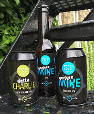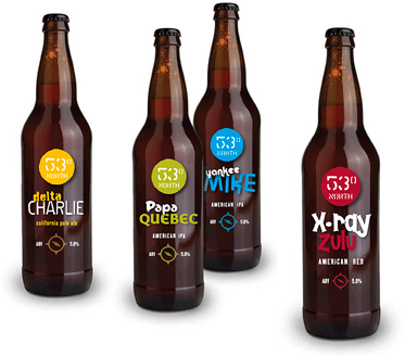
53 North
We were asked to develop a sustainable label design based on the client’s initial idea, with the aim of standing out in crowded supermarket beer aisles. We developed the initial phonetic alphabet idea into a cleaner, more campaignable look with some quality type and a cheeky twist, designed to encourage trial of the other terrific beers in the range.